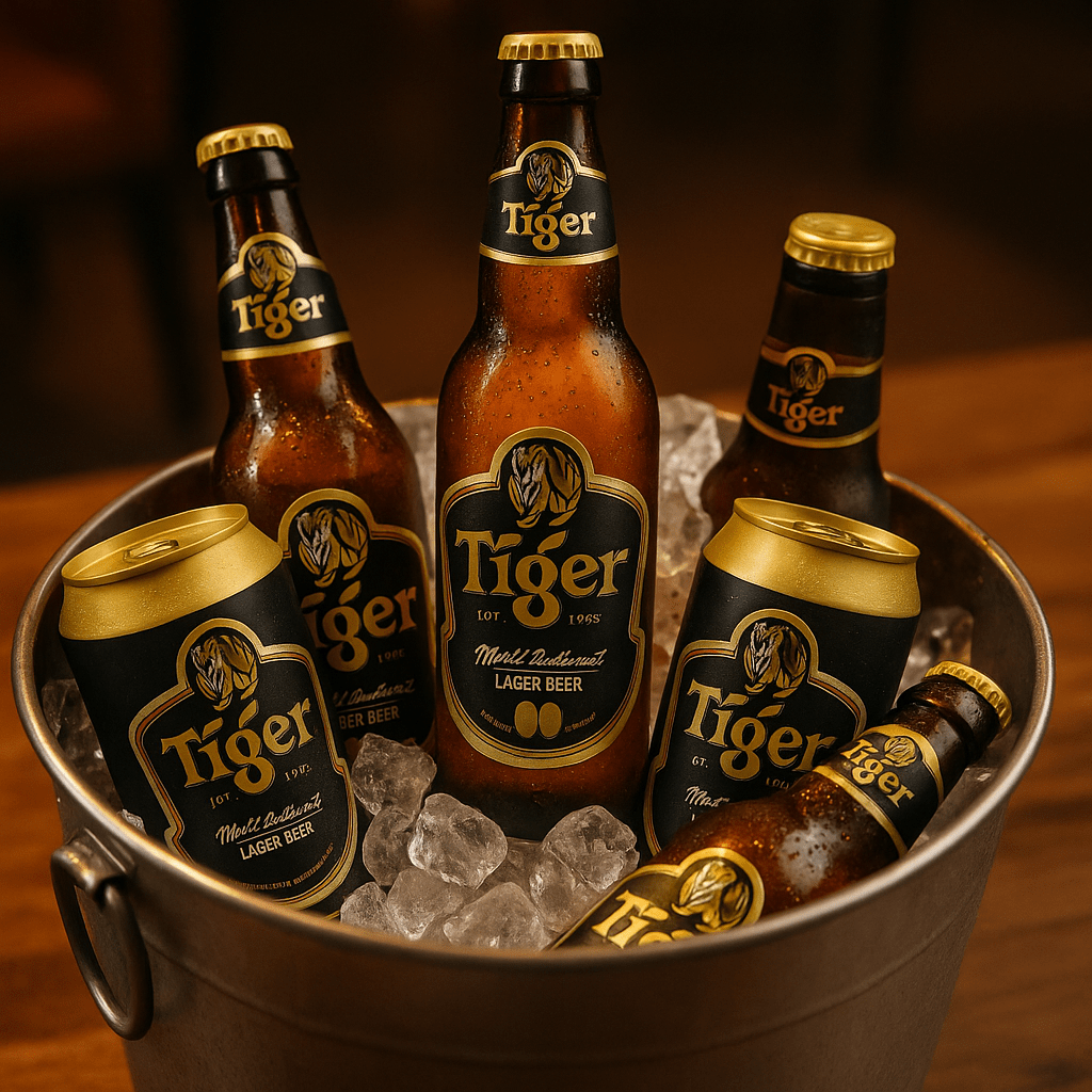
Self-initiated concept study. This project was not commissioned by or produced for Tiger Beer.
I used this study to explore how an established beer brand might stretch across three different occasions without losing its core identity: high-energy social drinking, a more premium presentation, and a limited-edition collectible range.
The design problem
Tiger Beer already has strong recognition, so the exercise was not to replace the brand but to test how far its visual language could move. Each direction keeps the tiger as the anchor while changing colour, finish, rhythm and packaging context.
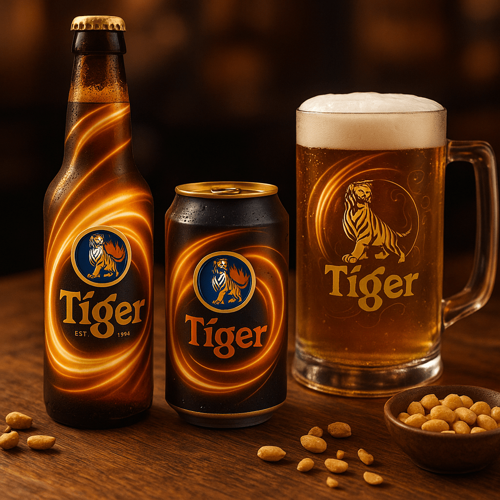
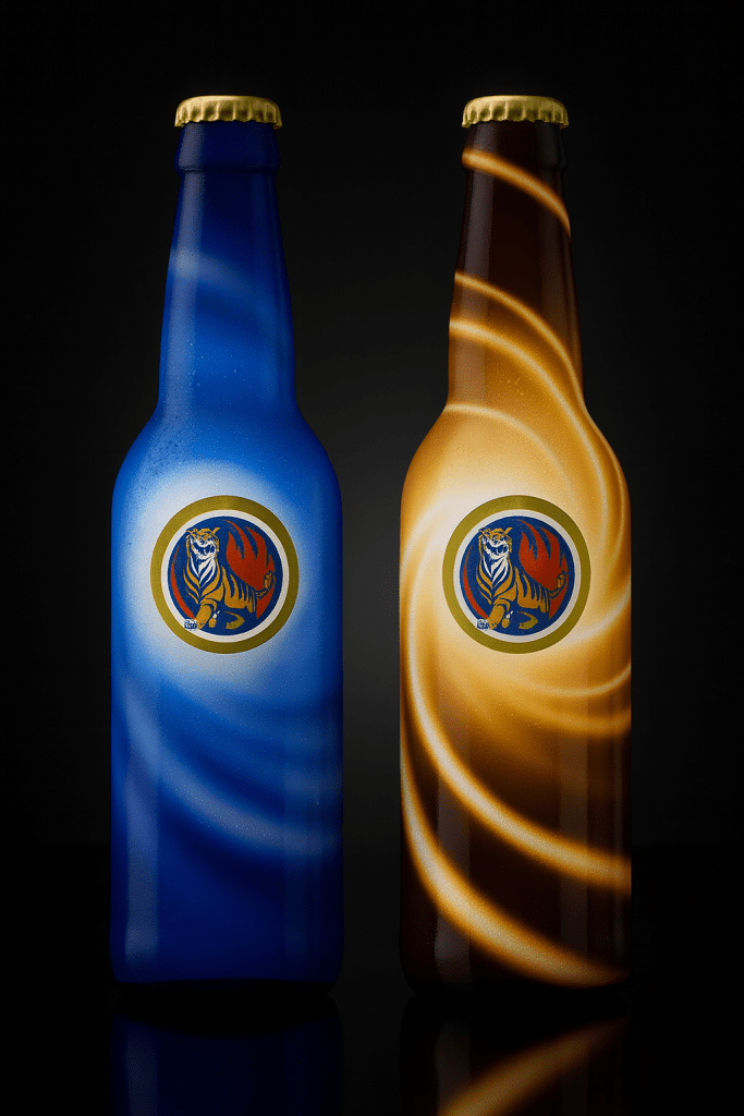
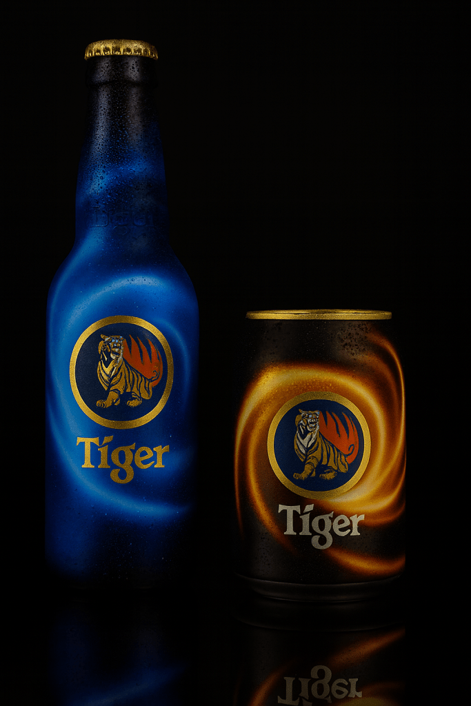
Direction 1 — Energy Swirl
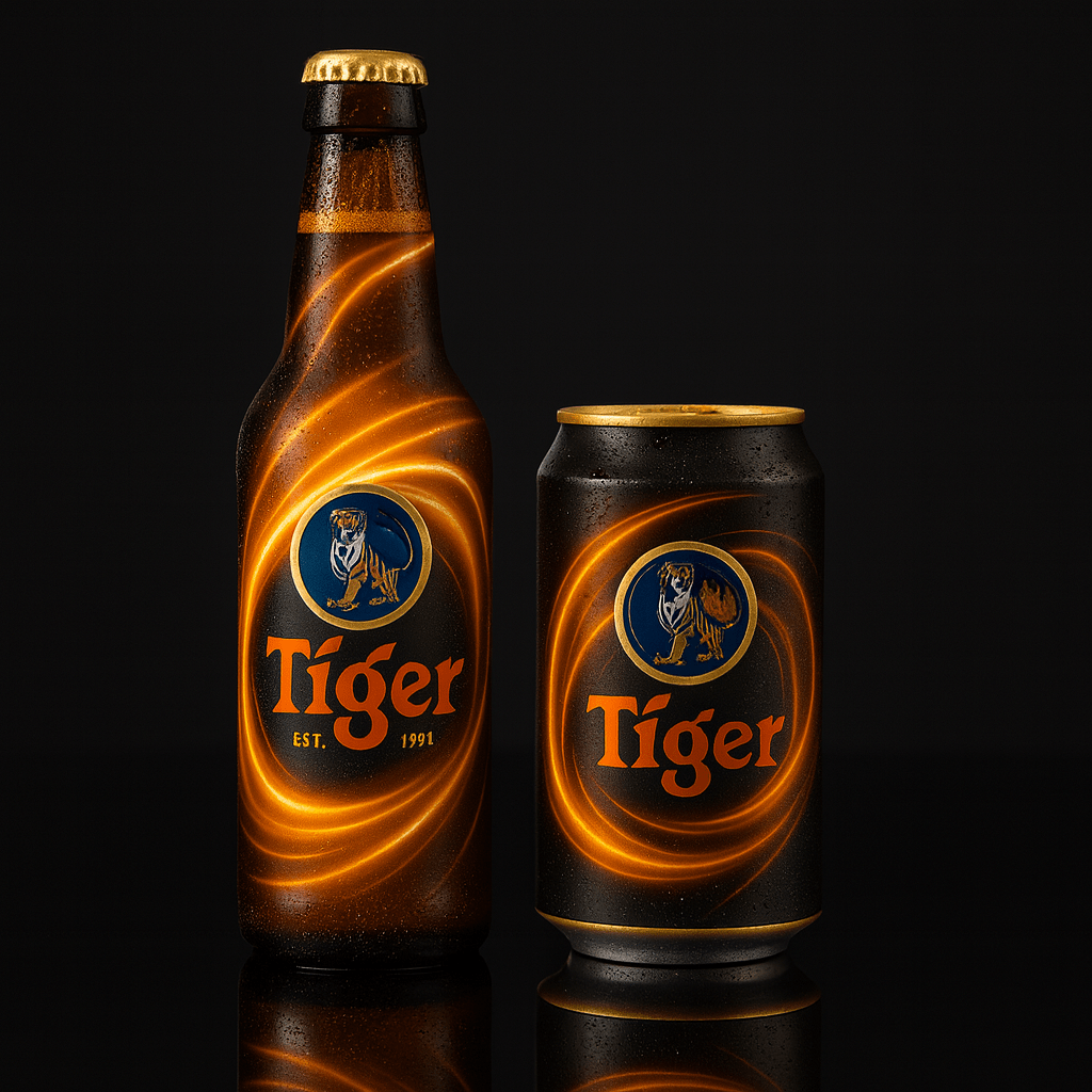
The first route uses flowing light and colour to create movement around the pack. The intent was to make the bottle and can feel more animated in social settings while keeping the brand name and tiger emblem easy to recognise at a glance.
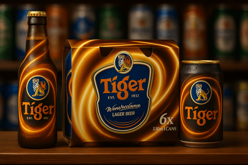
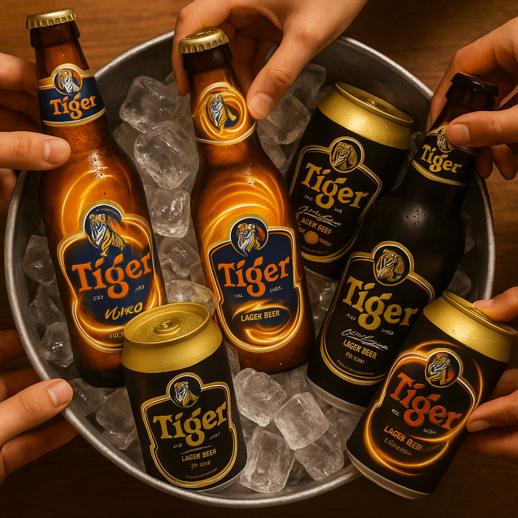
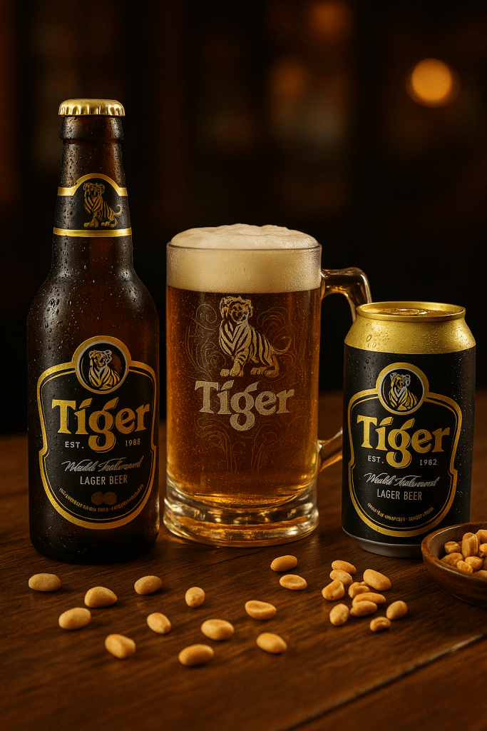
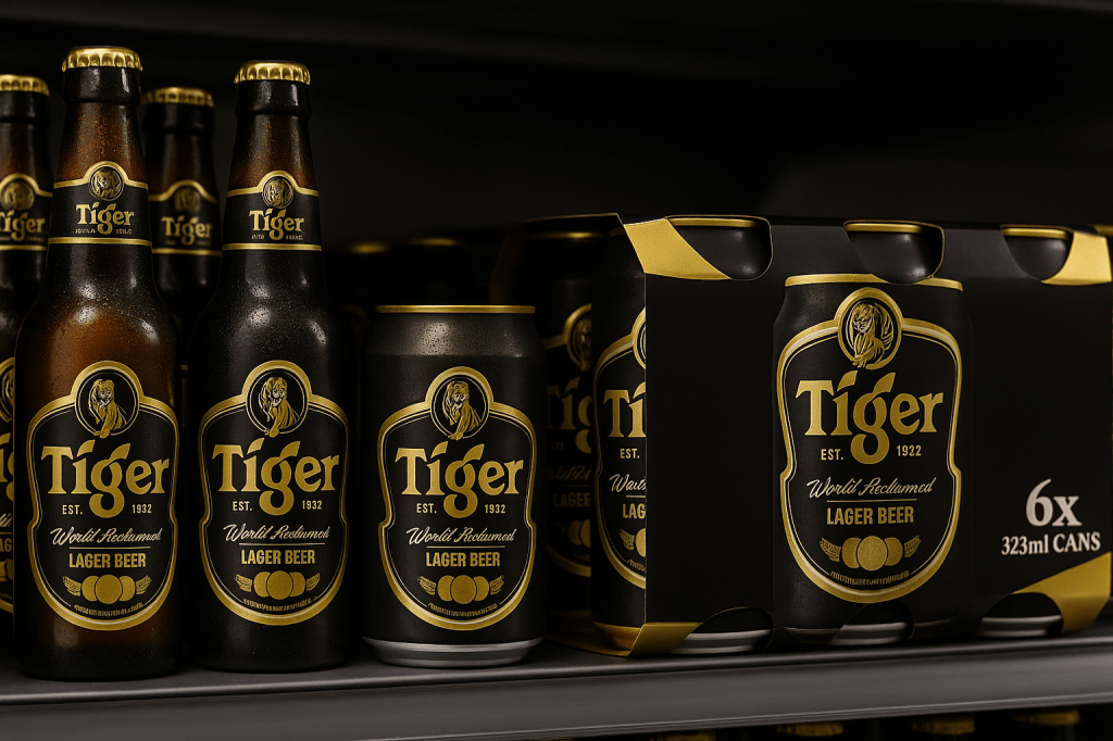
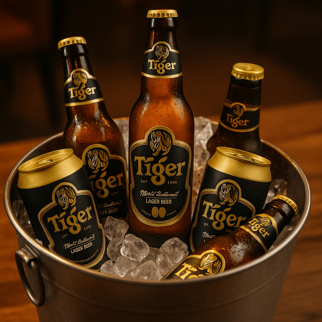
Direction 2 — Premium Black & Gold
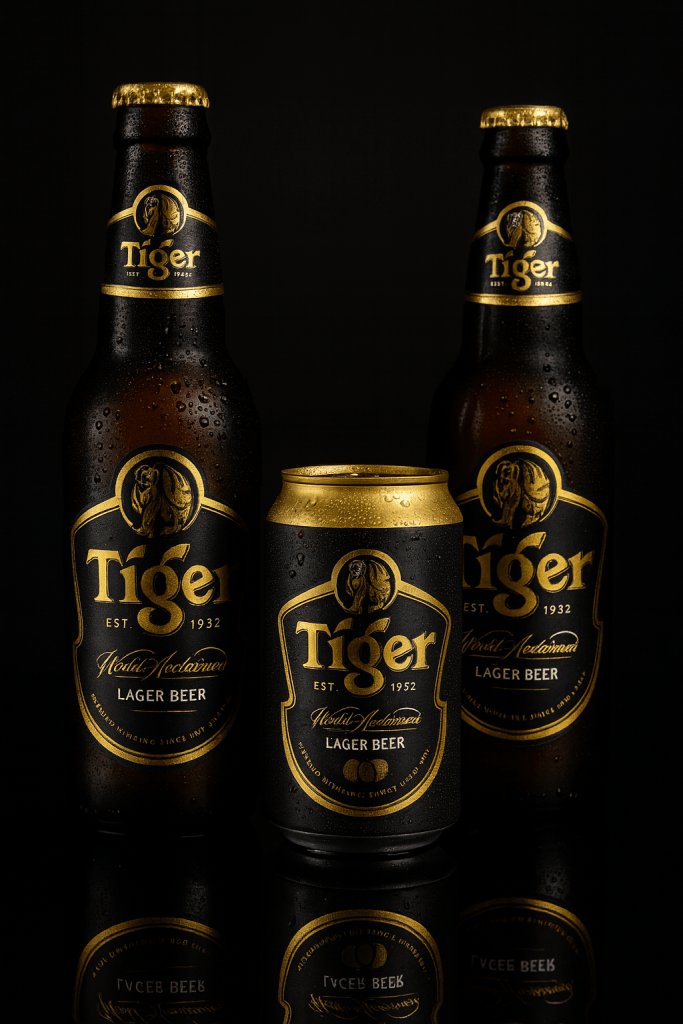
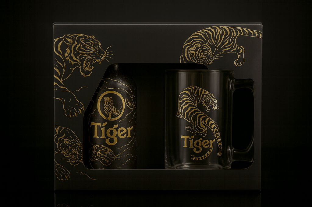
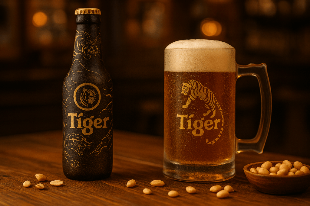
The second route deliberately removes much of the visual noise. Black becomes the main field, with gold used to give the tiger and brand details more weight. The idea was to test a version that could sit more comfortably in restaurants, bars and gifting contexts without pretending to be a different brand.
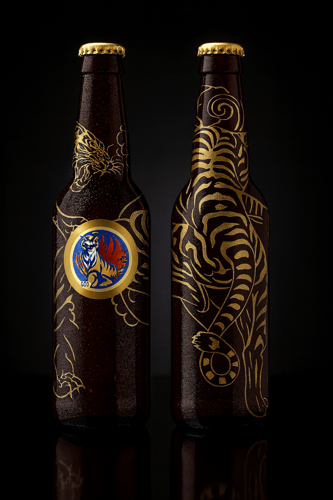
Direction 3 — Limited Edition Line Art
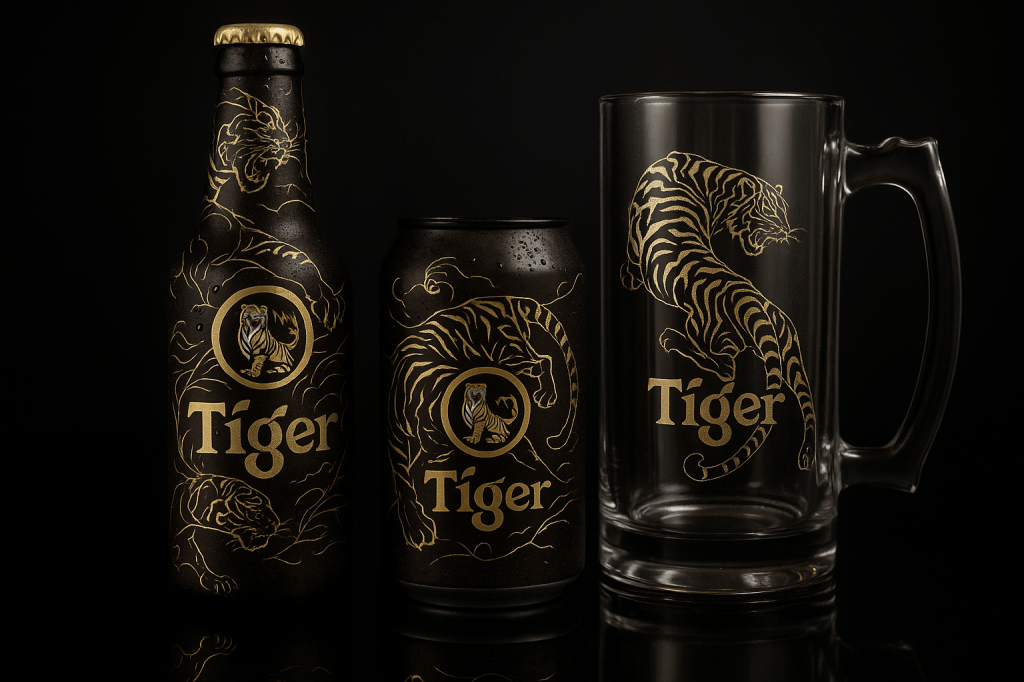
The third route turns the tiger itself into the collectible element. A gold line illustration wraps around the dark bottle and extends onto a glass, allowing the same visual language to move into a gift set without needing additional decorative devices.

What this study demonstrates
The useful part of a packaging concept is not the mock-up itself. It is whether the visual system can hold together across bottle, can, secondary pack and promotional extensions. This exercise let me test three very different moods while keeping the same underlying brand recognition.
Need packaging or production artwork?
I work on labels, packaging graphics, SKU adaptation, dieline artwork and print-ready production for small businesses and marketing teams.