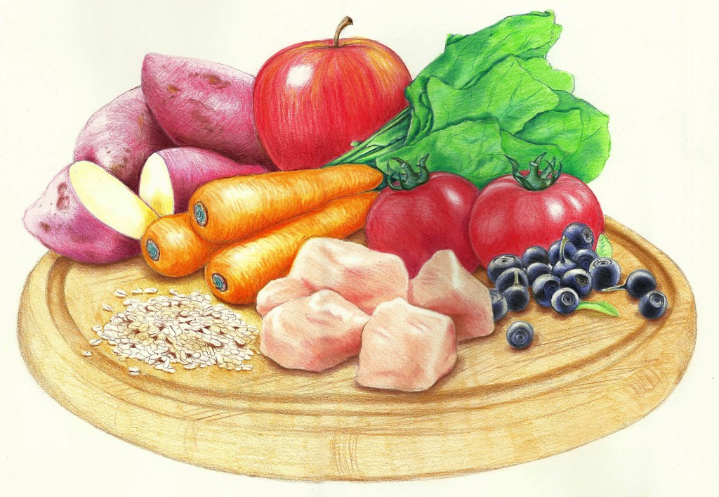
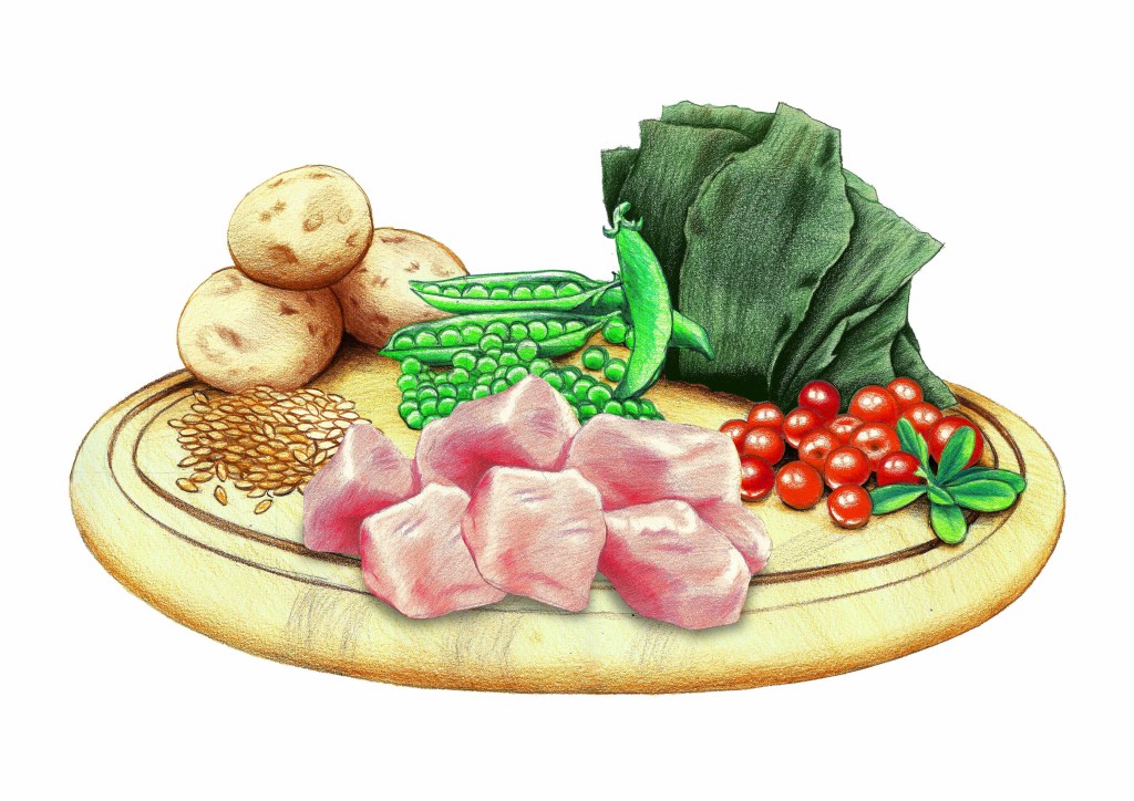
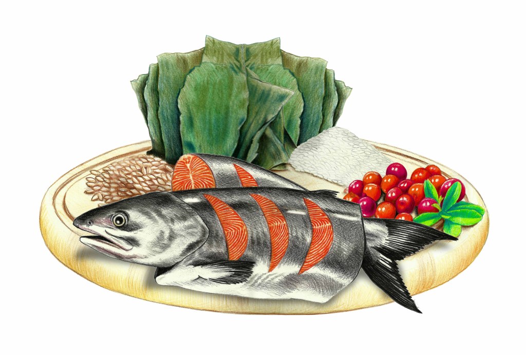
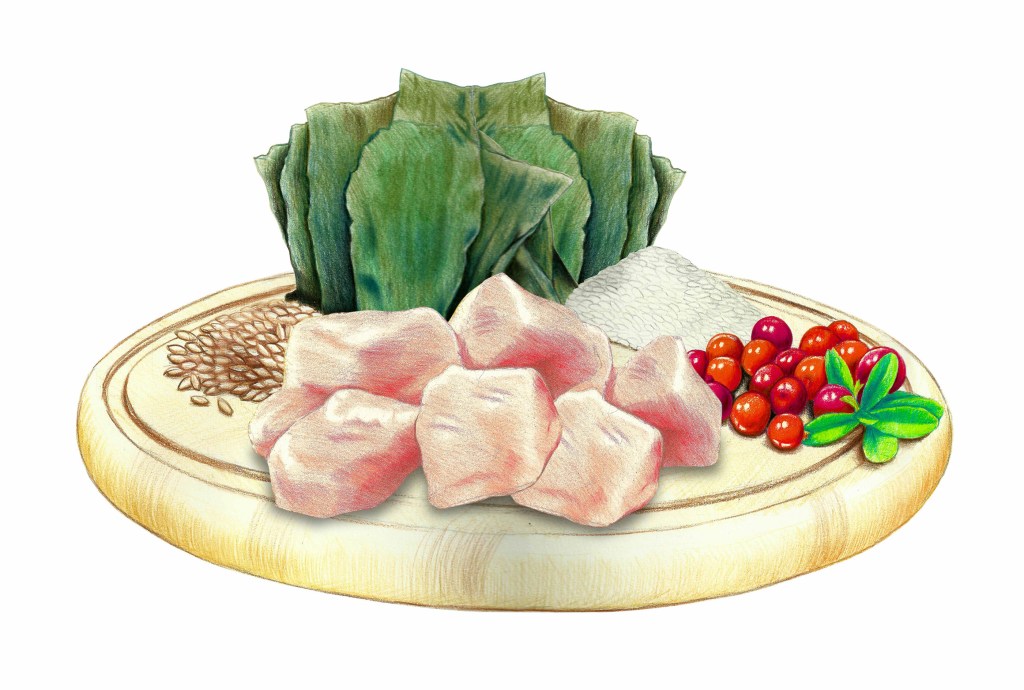
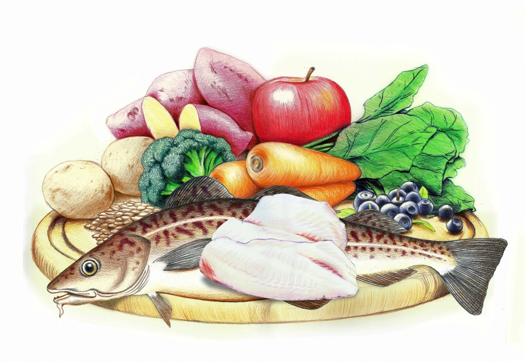
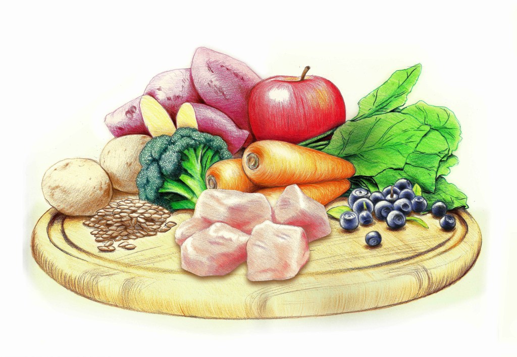
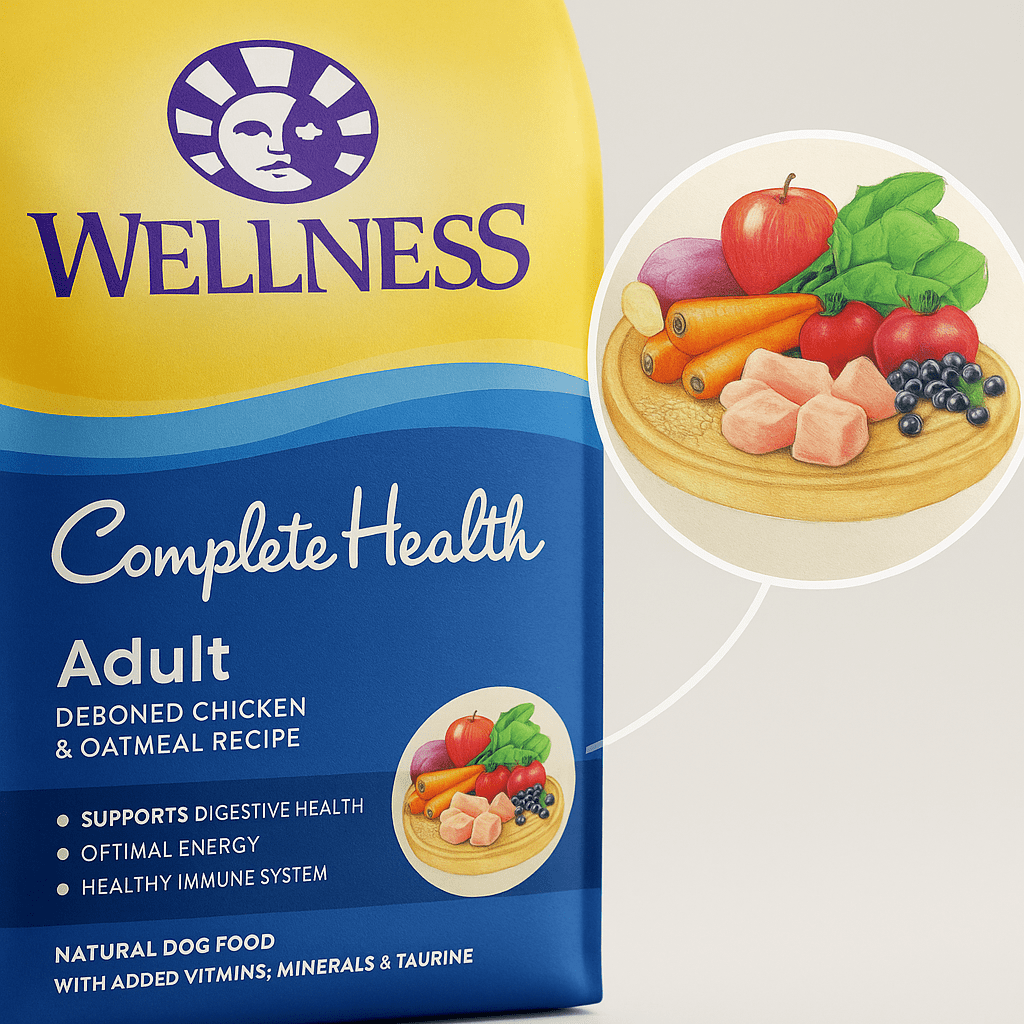
For Wellpet’s Japanese-market packaging, I was asked to create illustrated ingredient groupings rather than rely on food photography. The finished artwork had to feel fresh and appetising, but it also had to remain legible when reduced to small medallions on the pack.
The brief
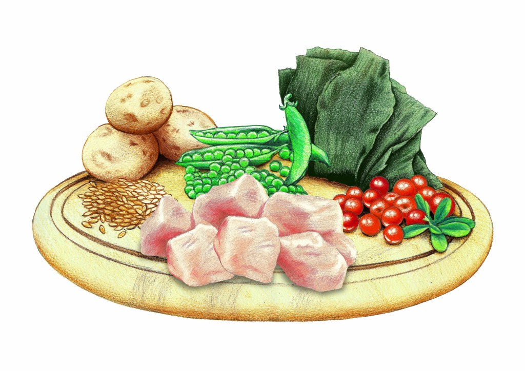
The client required illustration-led ingredient depictions for the packaging. That meant treating familiar proteins, vegetables, fruits and grains as small still-life compositions: realistic enough to be immediately recognisable, but simplified enough to survive reproduction at a much smaller scale.
Ingredient artwork
Process
I combined coloured pencil, watercolour washes and digital refinement. The physical media gave the ingredients a tactile quality, while the digital stage let me adjust edges, colour balance and contrast so the artwork remained clean when reproduced on-pack.
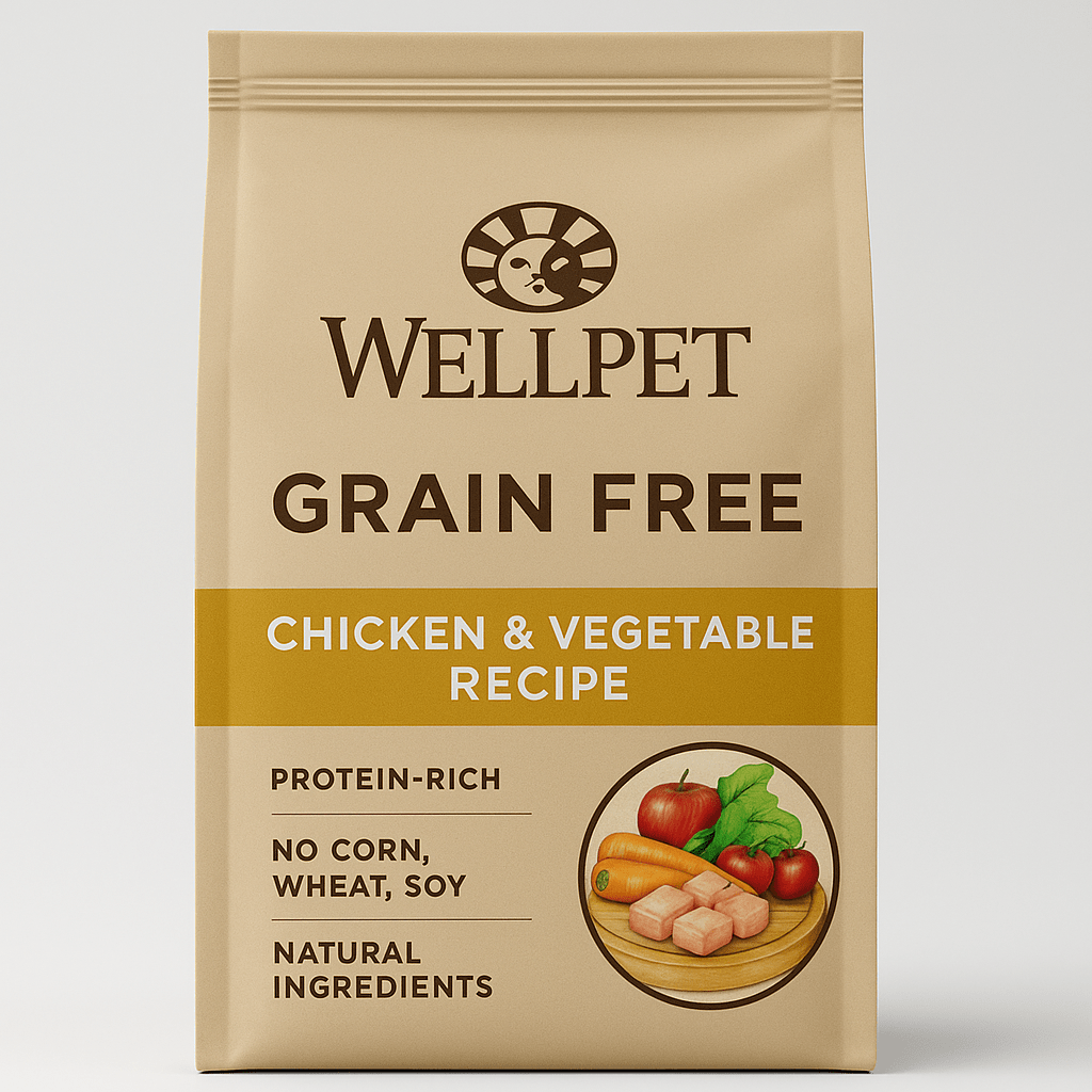
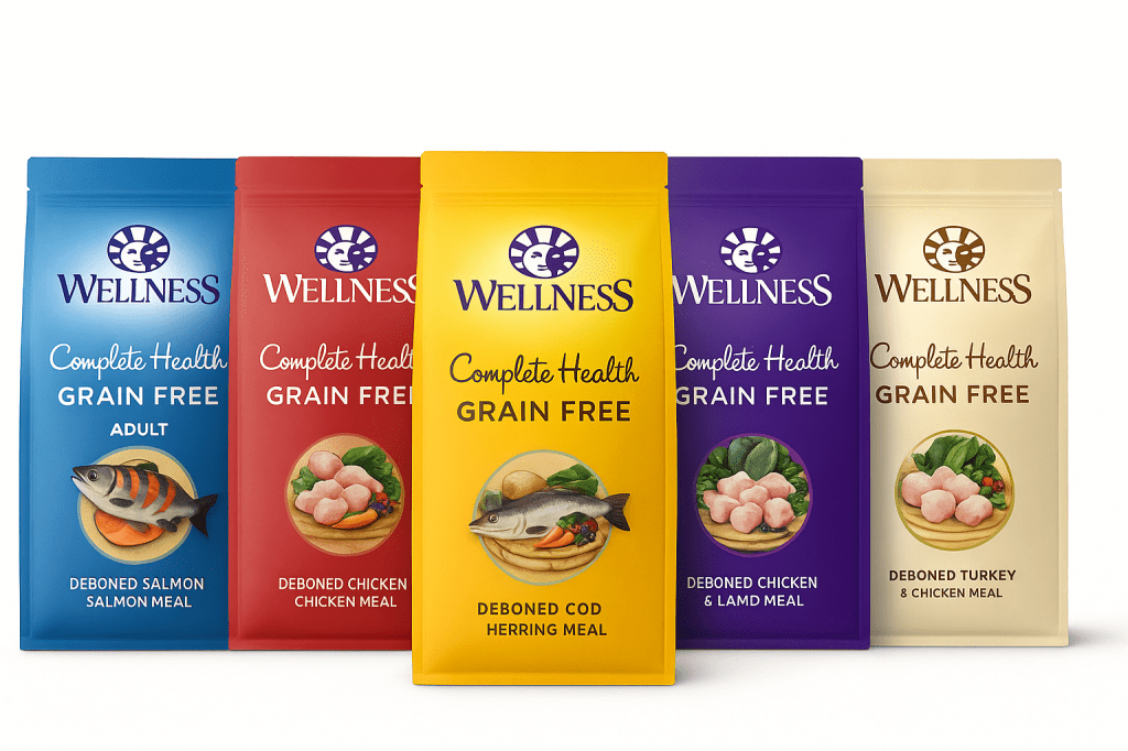
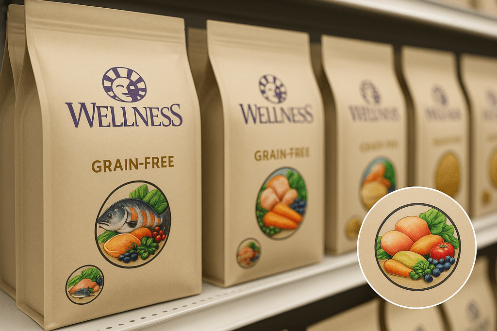
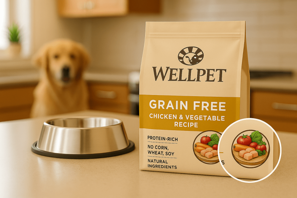
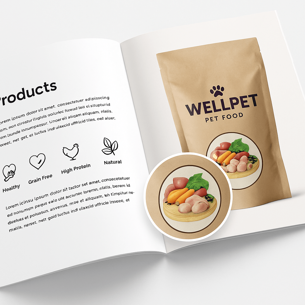
The main production problem was scale. Details that look convincing in a full illustration can collapse into visual noise once the image is reduced. I therefore treated each medallion as a packaging graphic rather than as an illustration that happened to be placed on packaging.
Application studies
The following images show how the illustrations were presented in packaging and promotional contexts. Some are later mock-ups created to demonstrate scale and placement rather than documentary photographs of the original production.

What the project demonstrates
This is the sort of illustration job where commercial constraints shape the drawing. The artwork had to be attractive, but it also had to reproduce reliably, communicate ingredient quality quickly and fit within an established packaging system. That balance between craft and production is the part I still find useful.
Need illustration that has to work on a real product?
I work across illustration, packaging graphics and production artwork, including jobs where the image has to survive small reproduction sizes and practical print constraints.