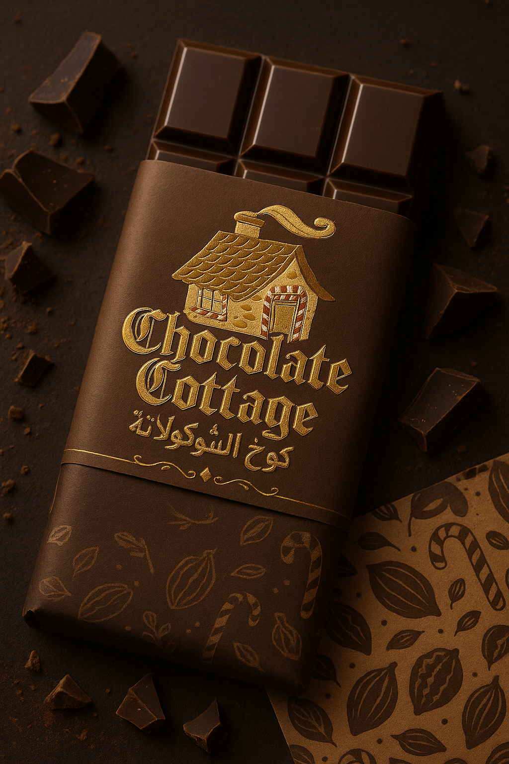
Chocolate Cottage is a Saudi Arabia-based chocolaterie whose identity needed to feel playful without becoming disposable. The brief called for a storybook quality, but the mark also had to work in English and Arabic and survive the less romantic realities of boxes, wrappers, signage and small print applications.
The identity
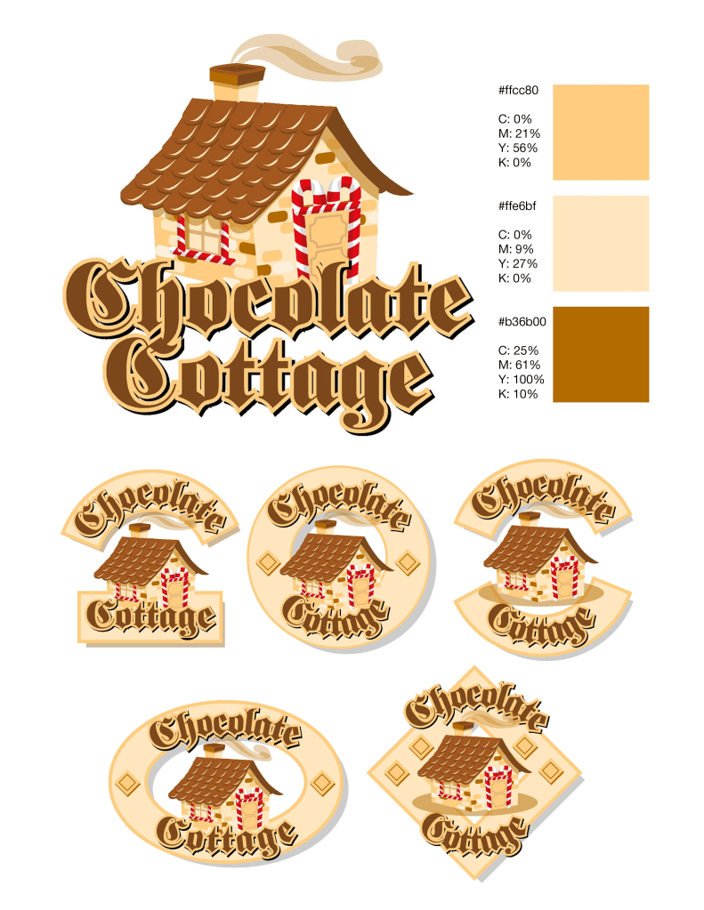
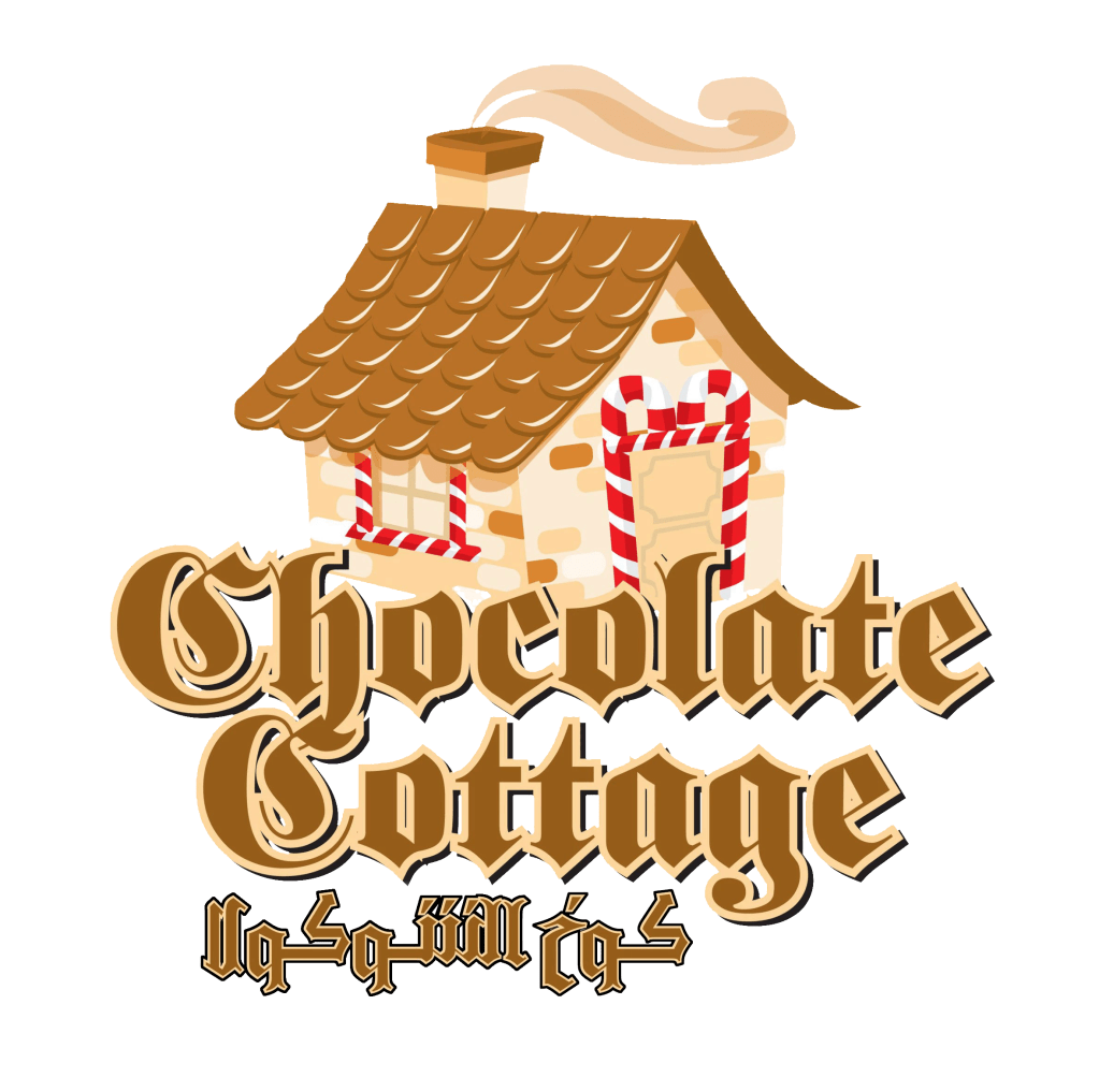
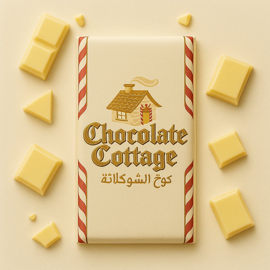
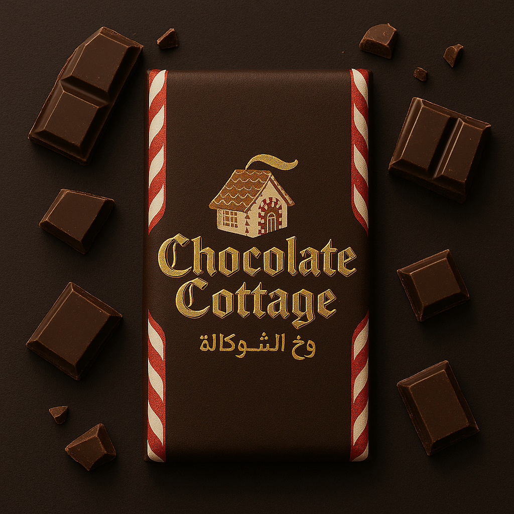
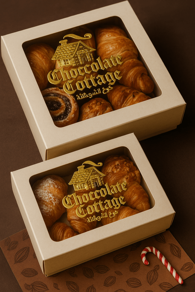
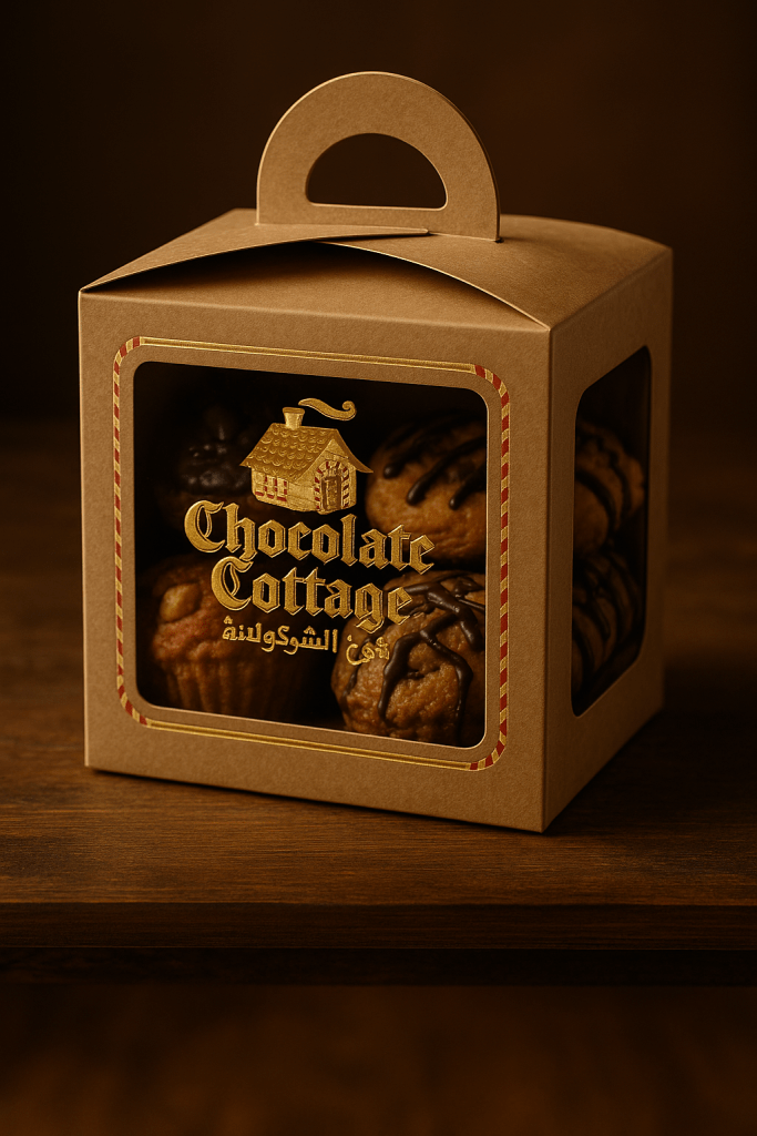
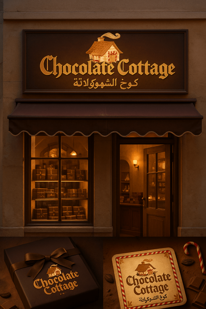
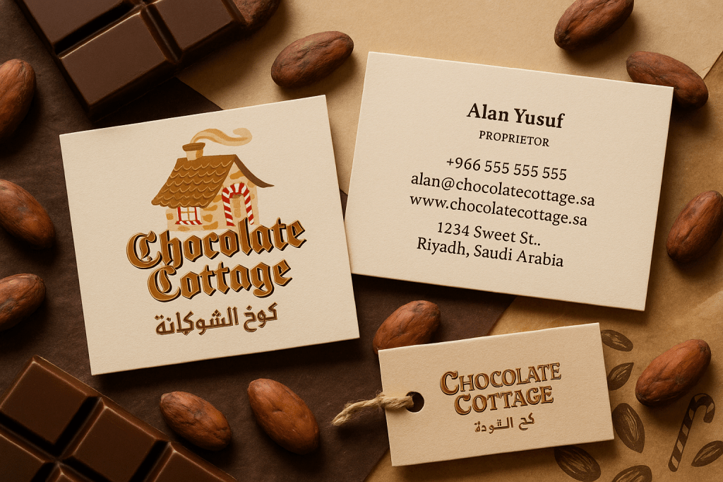
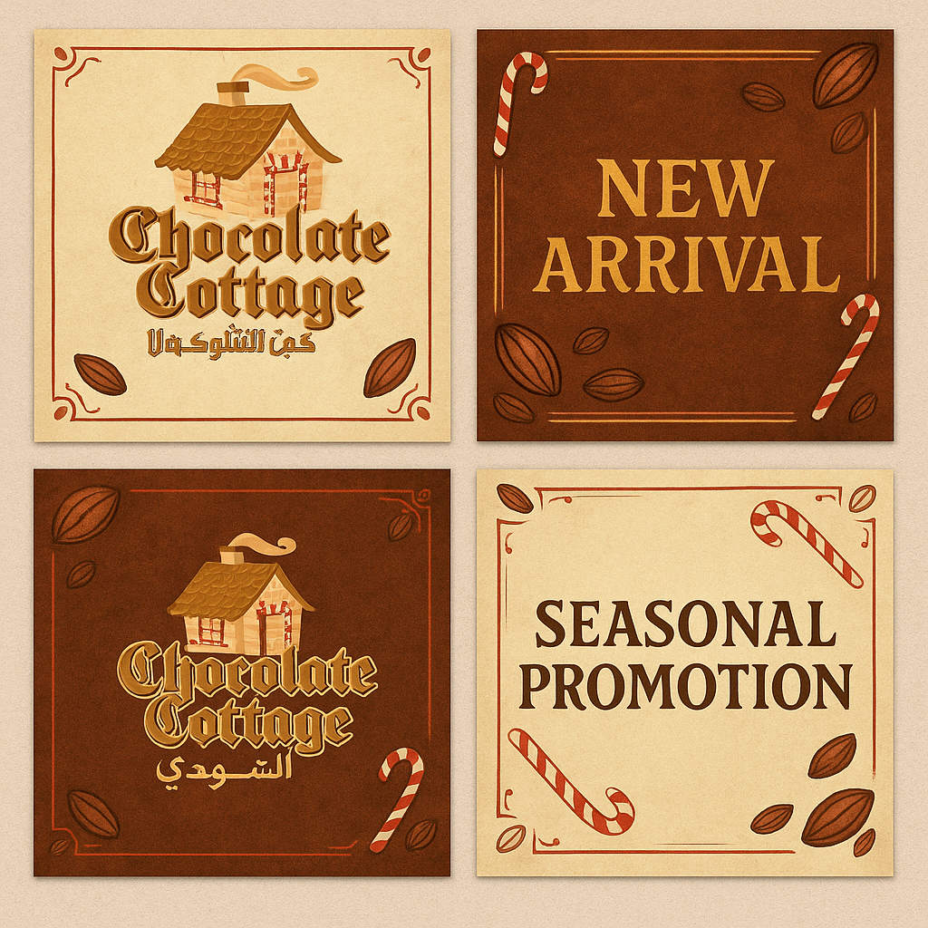
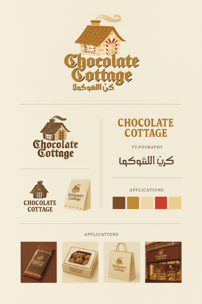
The main mark combines a gingerbread-style cottage, candy-cane details and bilingual lettering. Rather than treating the Arabic as an afterthought, the two language versions were considered as part of the same visual system so the brand could move between applications without looking like two separate identities.
Packaging applications
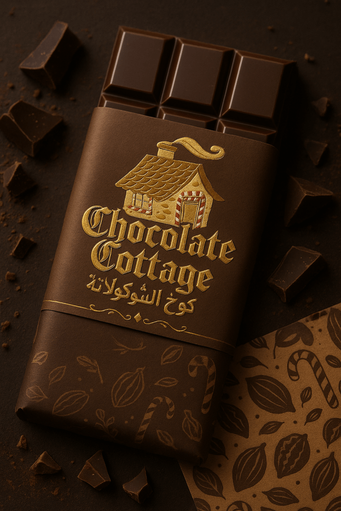
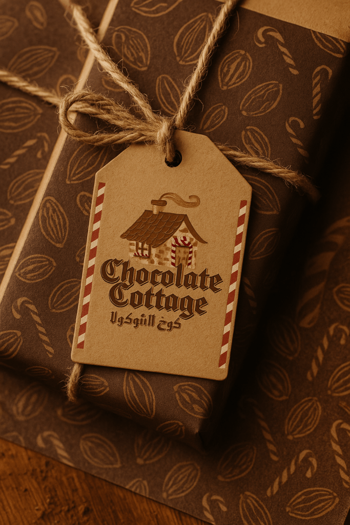
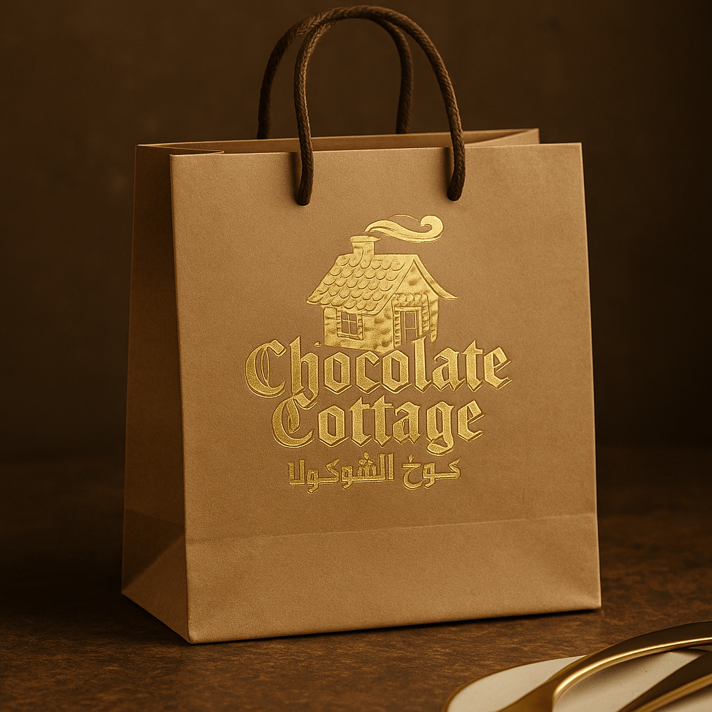
The following studies show how the identity could extend across wrappers, gift boxes and takeaway packaging. These are presentation and application mock-ups used to demonstrate the system rather than documentary photographs of every produced format.

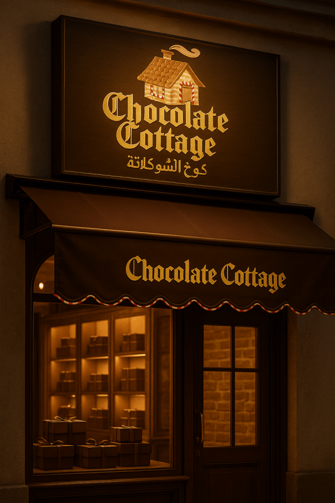
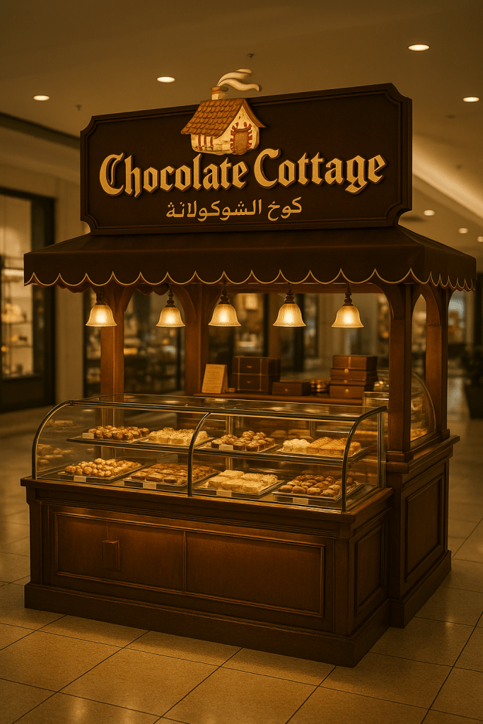
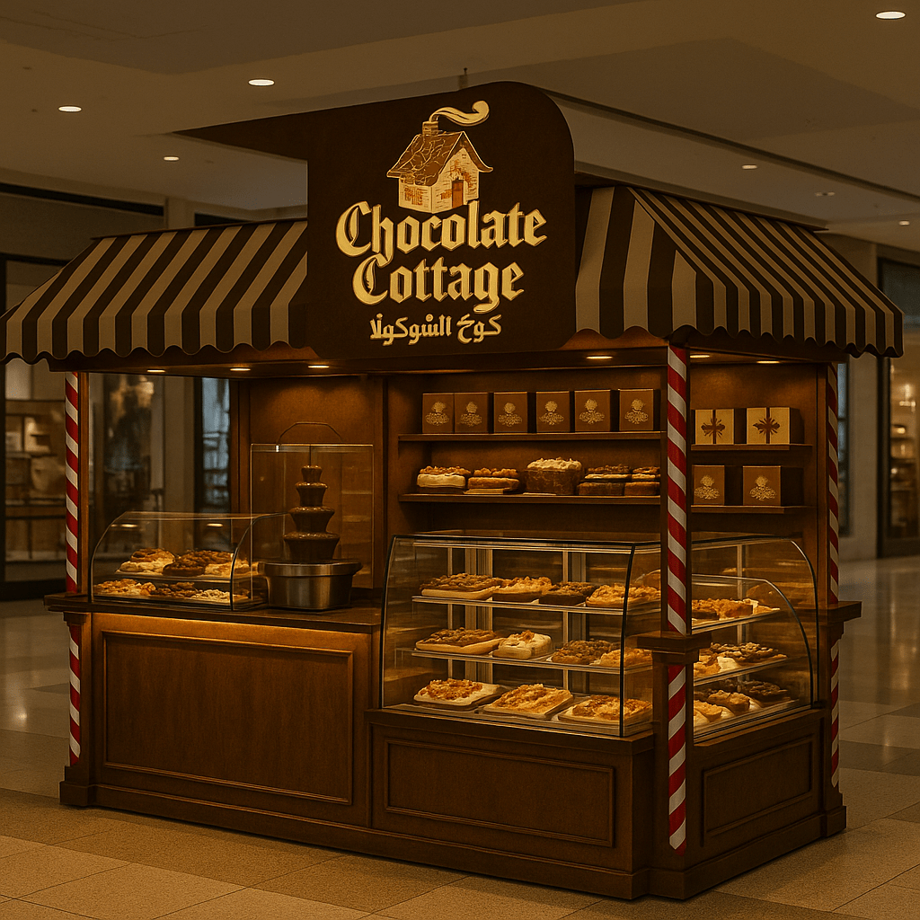
Retail environment studies
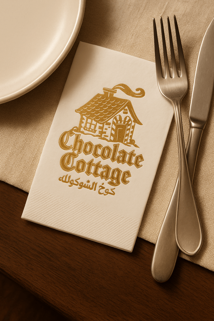
Because the identity was intended to feel immersive, I also explored how the cottage motif, warm lighting and decorative language might scale into storefront and kiosk environments. These images are visualisation studies, not claims that every shown environment was built exactly as depicted.
Print and digital extensions
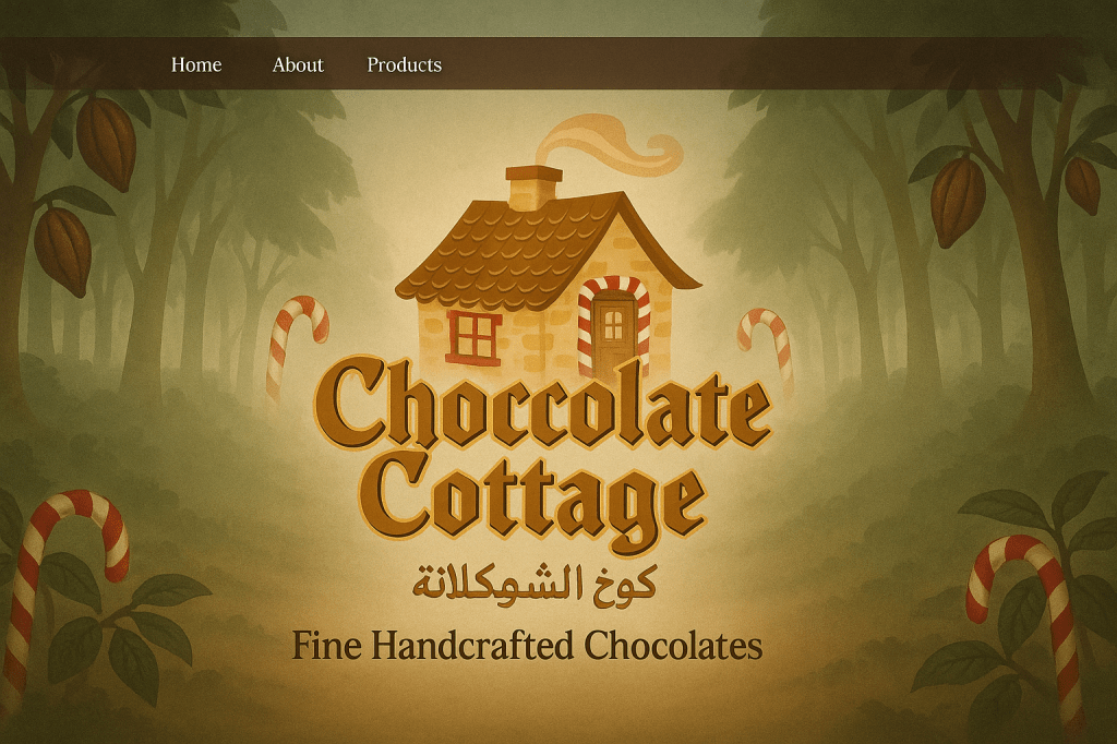
The system was also tested on smaller collateral and digital touchpoints. The useful test here was whether the logo still felt recognisable when the ornate elements had less room to breathe.
What the project demonstrates
The core challenge was not simply drawing a whimsical logo. It was making a decorative bilingual identity flexible enough to work when the application became very small, very large or structurally different. That tension between character and consistency is what gives the project its value in the portfolio.
Need a small brand system that has to work across real applications?
I help businesses refine identity systems and carry them through packaging, print, presentation and digital touchpoints without turning every new item into a separate design project.