Developed while at Total eBiz Solutions.
This project explored several visual directions for an internal National Heritage Board portal. The design problem was fairly ordinary in the best sense: staff needed announcements, events, directories and shared resources to be easier to find, but the portal still had to feel connected to the organisation rather than like a generic corporate dashboard.
The brief
I developed multiple interface proposals for stakeholder review, focusing on information hierarchy, modular navigation and a visual language that could carry NHB’s cultural remit without overwhelming everyday internal tasks.
My role
- visual and interface concept development
- layout and navigation structure
- colour, typography and icon direction
- page mock-ups for stakeholder comparison
Theme 1 — Modular dashboard
The first direction uses clear content modules and colour separation to make common internal functions easier to scan.


Theme 2 — Stronger visual navigation
The second direction pushes the navigation blocks harder, using larger visual areas and a more obvious separation between content types.


Theme 3 — Wider editorial treatment
The third direction opens the layout horizontally and gives imagery and feature content more room, while retaining clearly separated utility areas.
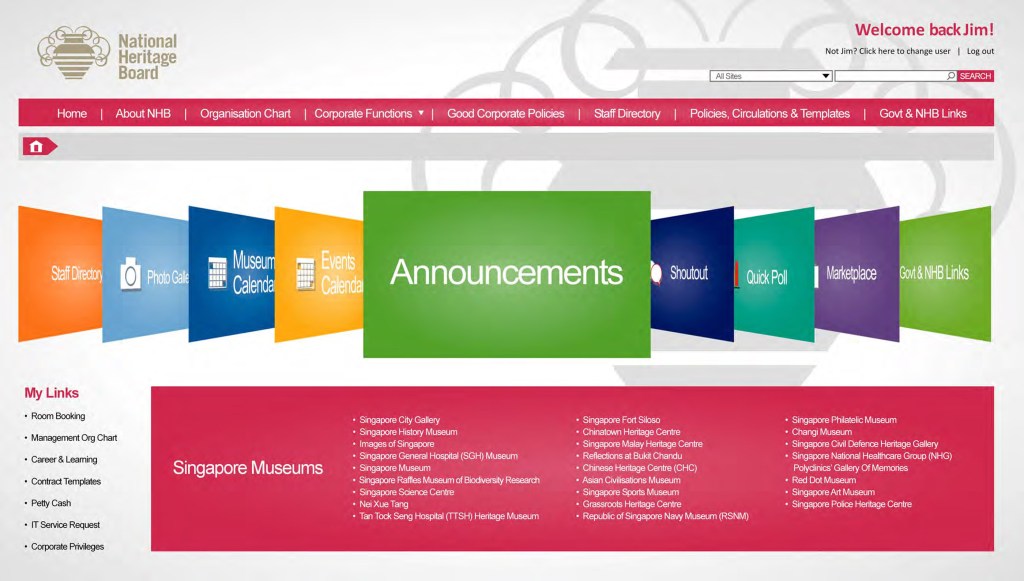


Theme 4 — Heritage-led framing
The fourth proposal gives the heritage context a more visible role, using imagery and framing devices without sacrificing the practical portal structure underneath.


What the exercise demonstrated
These were proposals rather than a claim that every screen shown became the final deployed intranet. The value of the exercise was in giving stakeholders materially different options to compare: how much visual character the portal should carry, how modular the navigation should feel, and where organisational identity should sit in relation to everyday usability.
Need a presentation, portal concept or information-heavy layout?
I work on structured visual systems where hierarchy and usability matter as much as surface styling.